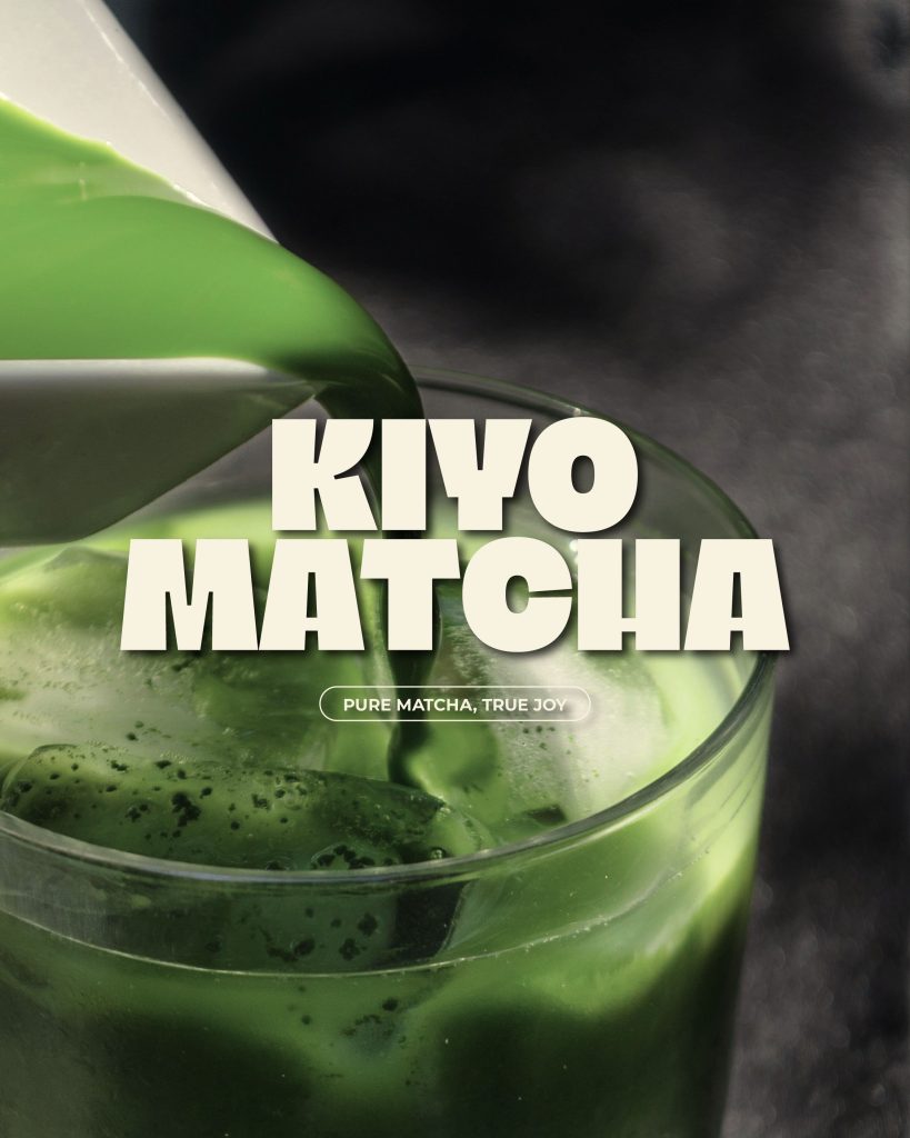
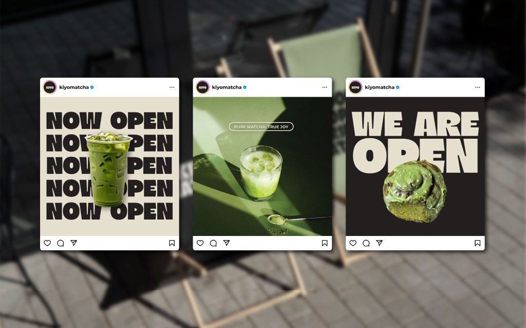
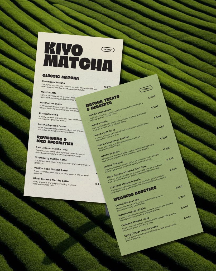
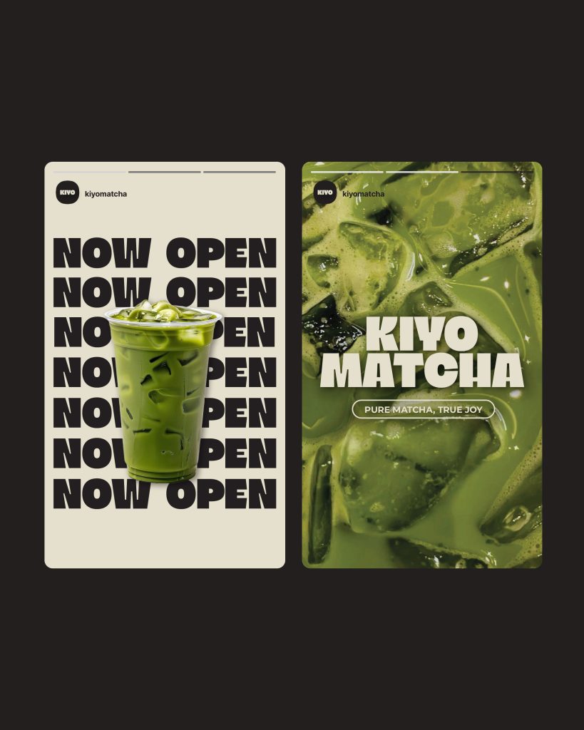
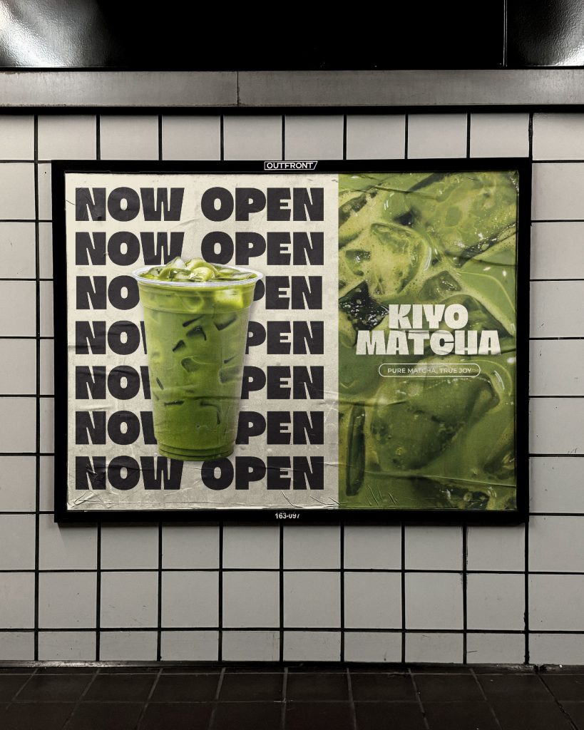
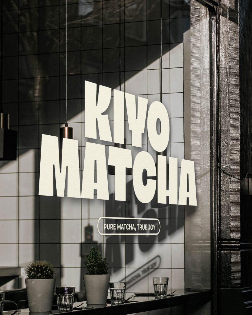
Skip to content

Work

brandvisual identity

Kiyo Matcha

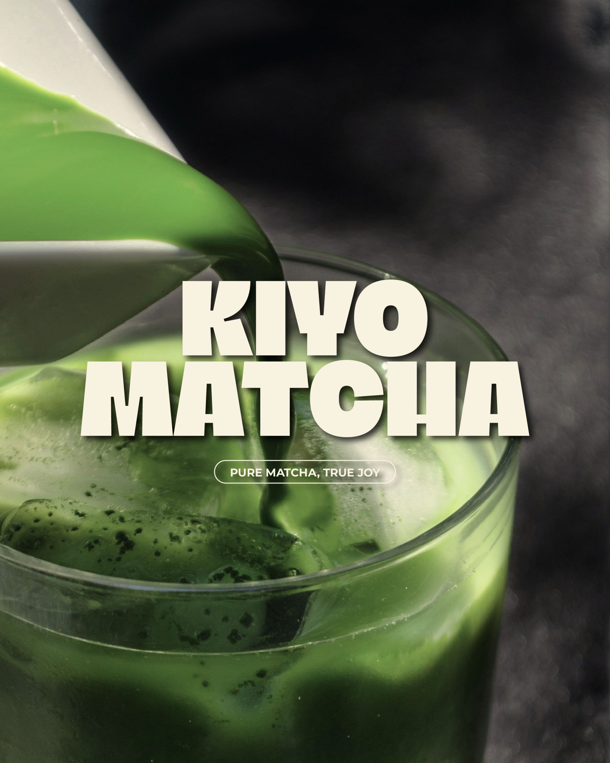
The Kiyo Matcha project was created as part of an Instagram design challenge, with the goal of pushing creative boundaries and exploring bold yet minimal branding solutions. While it’s not based on a real client brief, I approached the concept as if it were, focusing on clarity, strong visual identity, and a modern, cohesive look. I aimed to keep the design simple but impactful, highlighting the purity and energy of matcha through clean lines, bold typography, and a fresh, natural color palette.

editorialZine

KCKFLP Zine

For my university thesis, I created a zine exploring a lesser-known yet popular subculture. The publication aims to capture its unique spirit and lifestyle, drawing inspiration from the 1990s grunge aesthetic. Grunge, like the zine medium and skateboarding subculture, symbolizes rebellion, nonconformity, and an independent way of life. Its raw, authentic style aligns with the subculture’s values of creativity, self-expression, and rejecting mainstream norms. This zine bridges subcultures and broader audiences, using design to convey individuality and belonging beyond convention.

editorialtypography

Type Specimen Booklet

I created a booklet that reflects the style and essence of the Neue Montreal font. Designed as a cohesive extension of the typeface, the booklet mirrors its sharp, elegant features and modern versatility. Each page is carefully crafted to showcase the font’s personality, blending clean layouts with dynamic compositions that align with Neue Montreal’s aesthetic. This approach ensures the booklet is not just informative but also a visual celebration of the typeface’s design philosophy.

postertipography

TYPOZONE Exhibition Poster Design

This poster, created for the TYPOZONE exhibition by Eszterházy Károly Catholic University, was selected among the best in the country and showcased at the Eger Church Gallery. The theme, “Human Touch,” emphasizes individuality, emotion, and the artist’s personal perspective, highlighting art as a blend of skill and personal expression.

editorial

101 Sentences on Book Design

Redesigning Albert Kapr’s publication using the 101 principles of typography and design, the project balances traditional practices with modern trends and digital needs. It optimizes visual hierarchy and readability for both print and digital formats, incorporating innovative layouts to enhance user engagement while honoring the original content.